Creating ecommerce businesses has been on the rise for a long time. But this pace has gained even more momentum since the pandemic began. There are a number of reasons that attract many would-be entrepreneurs to the ecommerce space. In this article, we are going to talk about some new trends in ecommerce website design.
Keeping track of trends plays a very important role in running a business. Especially when you are in the ecommerce industry, you have to take care of it a lot. New technologies and new design theories are arriving in the market every day.
Different companies are making use of various technologies to grow and get ahead of the competitors. Some are using email marketing for ecommerce stores, others are using immersive video. So, let’s take a look at some of these trends, and see how much help they could be in enhancing and growing your ecommerce business.
Embrace micro interactions
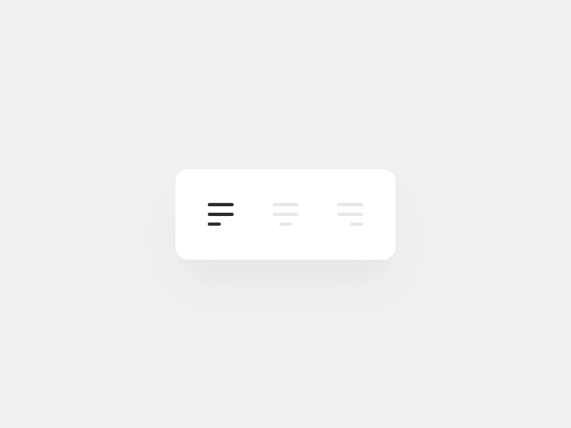
Micro interactions is a term to use for those small and subtle movements on specific items, such as navigation items or price panels, etc. We’ve all submitted a form before, and then seen some short animation whilst it gets the results; that’s a micro interaction.
 (Source)
These micro interactions add lots of personality to websites, and shows the user that you are just as invested in the small things that make an experience special.
Use video to complement images
Product videos are so much better than still images. They allow you to show the main features of a product in a far more engaging way. And, in the majority of cases, they’re also better for user engagement.
If you’ve been looking for a way to add video to your product pages, but weren’t sure how to go about it, you’re in luck.
If you’re looking to add video to your product pages, you’ll need to have a couple of things in place before you get started. First off, you’ll need to have a video hosting platform that you can use to host your videos.
Some of the most popular video platforms are YouTube and Vimeo. Then you need to make sure you have a Facebook Pixel set up to track video views.
You don’t need expensive video production gear for video recording or video editing either; many sites simply use their smartphone cameras to take short videos of the various products, and it works!
Use cinemagraphs for something different
This is another trend which is on the rise nowadays. If you are unaware of what cinemagraph is, here is a brief introduction. A cinemagraph is more like a static image. But there is a small animation effect in the image that makes it appear as a short video.
Ecommerce website users find this effect very pleasing, and because the effect isn’t overused, they look really original..
The biggest advantage that you get from creating cinemagraphs is that they are typically smaller in file size as compared to a video. By using this technique, your website will be convenient to be used and loading time will be reduced.
Material design based website
This is one of the most popular ecommerce website designs today. A material design is one that has ultra-modern taste with minimum functions. Such a design is highly efficient and very productive.
Buttons and several other elements of the website have shadows behind them. These effects add a little depth to the webpage. With the proper use of such design elements, you can make one of the best content-based websites.
The whole idea behind this style of website is that it helps in creating a clean and beautiful interface. Such an interface will help your customers to interact with your website in a much better way.
Keep your focus on smartphones
Just about every month, the percentage of users accessing the Internet from their smartphones is growing. It is easily becoming the main device segment. If you are still making a website for desktop users only, you will be automatically losing a significant number of potential customers.
In the present-day world, a large number of people are accessing the internet via their smartphones. So, if you want to get an edge over your competitors, you should focus on using responsive design techniques, so you deal with smartphone users equally as well as desktop users.
Make your ecommerce website design entirely focussed on smartphones, and secondly for larger screens. There are several techniques that would make your website adaptive to big screens; such as tablets, game consoles and desktop computers.
Use consistent, attractive images
Images are another important feature that you should consider including in your ecommerce website design. Visuals that are appealing to the users play a very important role in promoting your products among new customers.
Experts say that you have only a few seconds to make the first impression of your product in front of the customers. And missing out during that time will ruin your whole efforts. So, try to add bold and attractive images related to your product on the official ecommerce website.
When we speak of consistency, try to keep the images all similar in style. Use a blue background on some of them, and yellow on others? Consider reshooting them all to have a matching color background for consistency sake.
So, the websites that are full of attractive and high-quality images of the product are going to grab the attention of a large number of users. There are plenty of product photography tips on the web to read; it’s easier than you think to create beautiful images.
Content in the form of text helps a lot in making your customers aware of the product but too much text can be boring. You should avoid all those practices that can annoy your potential customers.
In such a time, putting multifarious images on your website can be engaging for the users.
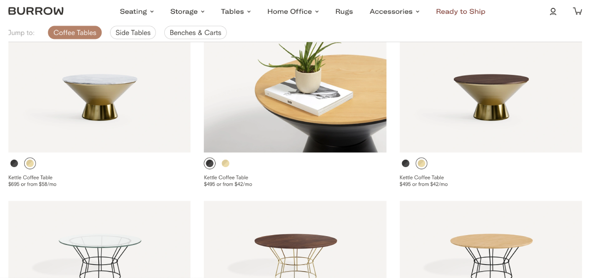
 Beautiful product imagery at Burrow.com
Simple navigation
As with all websites, not just ecommerce, it goes without saying that a simple navigation structure works far better than a convoluted, and confusing one.
What we mean is that the page names, menu items and links are all simple to understand and find and that your ecommerce user can easily navigate from one page to another without too much thought.
Use long scrolls and lazy loading techniques
This is another great trend going on these days. Remember in earlier days when we had to click on the next page option very often. That was quite a boring experience. But now the technique of long scrolls is being used widely.
With the help of this technique, you will be able to contain more items on the same page (as much as 100). The biggest advantage of using this technique is that it keeps the users engaged for a long duration of time without any break.
Then there is a technique called lazy loading. It helps the website in loading new items at the bottom of the page when the users scroll down.
With the proper combination of both these techniques, you can make a really interactive website that anyone would enjoy exploring.
Humanised chatbots
We prefer speaking to humans than robots, right? Chatbots are becoming more human-like in their interactions and look.
They are more aware of context and their responses are more natural.
Humanised chatbots are being developed to work in the same way as humans. They can understand and learn from what you say and can tailor their responses to suit your needs.
At the moment, most chatbots are nothing more than a short-term solution, a professional answering service that is there when you need it, but not much else.
Having a chatbot that goes that extra level makes a huge difference to your potential customers.
Start blogging about products (and solutions!)
A blog is a great way to create awareness about your business and build a strong brand image. A blog can also be used to offer tips to existing customers.
Use your blog to build a database of potential customers for your business. Promote your products and services on this blog, and then share it frequently on social media. Make an effort to promote every blog post like it is a new product in your store – it may take time, but you will see your audience grow exponentially.
Write complete product descriptions
You should write detailed, keyword rich but conversational product descriptions.
A great product description can be a difference maker for your product. This is the first step in the sales funnel, and it’s the most important.
It’s also one of the hardest parts of the process. You can use stories to describe your products. Take a look at the way Appsumo describes any of their deals; it’s always a story, and always very clever.
Stories are a great way to direct people, via their inspiration to buy the products. Through stories, you can steer your focus of content away from just selling and towards solving shoppers’ problems.
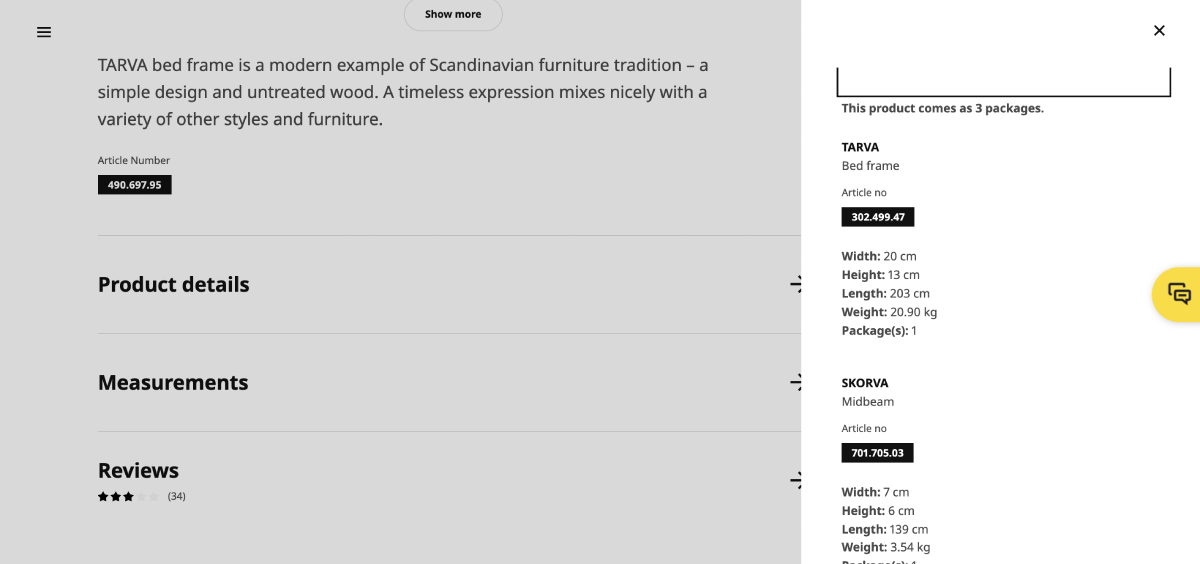
Make sure to provide a detailed description. I recently had to measure my car to see if my planned purchase from IKEA would fit. Their website not only shows the product measurements, but also the package measurements for when you take it home. That turned out to be so helpful!
 IKEA website, showing packaging measurements.
Final words
There are far more ecommerce design tips I could give you for your ecommerce business, however the above are a really good summary as to current trends.
You can use any or all of these above tips and ideas in your ecommerce website design to make your store more interactive. You should try a few, and see how well they work for you.
About the Author
Miles Burke has been working on the web since way back in the last decade of the 20th century. He has created and built a number of businesses over that time. His passion was originally in design, and now more in growth and marketing, something you will see often written about on his personal blog.
PRmention is a digital PR agency for startups & SaaS businesses. Occasionally, we accept high quality contributed content and we’d love to hear any ideas you may have. Feel free to email us on guestcolumn@prmention.com if you are interested in contributing.

